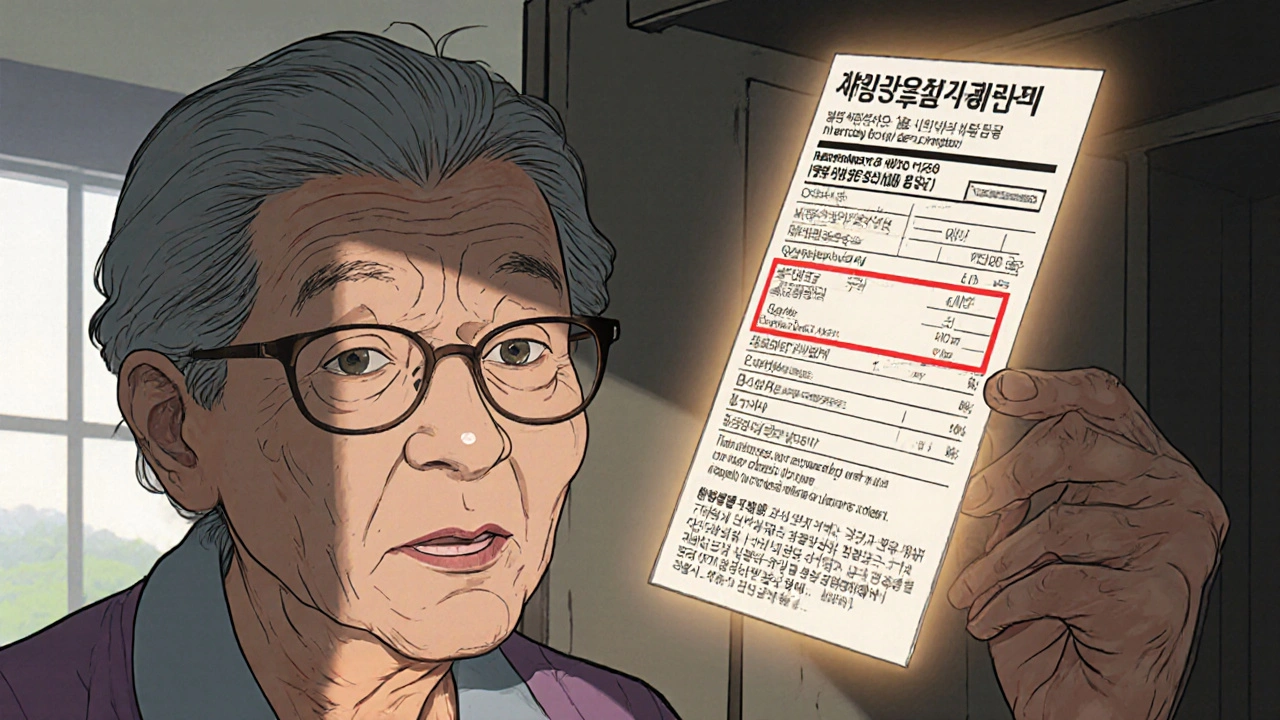
When you pick up a prescription, the label should tell you exactly what to do—without forcing you to squint, guess, or call the pharmacy three times. Accessible prescription labels, clear, easy-to-read medication instructions designed for people with vision loss, cognitive challenges, or language barriers. Also known as plain-language labels, they’re not a luxury—they’re a basic safety tool. Too many labels still use tiny fonts, confusing symbols, and medical jargon that even educated adults struggle with. That’s dangerous. One wrong dose, one missed instruction, and someone could end up in the hospital.
People with low vision, dementia, or limited English often rely on family members or caregivers just to understand their own meds. But that’s not a reliable system. What if the caregiver is tired? What if they’re not home? What if the label says "take with food" but doesn’t say which food, or how much? Medication readability, how clearly a label communicates dosage, timing, and warnings is the missing link in patient safety. Studies show that over 40% of older adults misread their labels, and nearly 30% of those mistakes lead to hospital visits. It’s not about being careless—it’s about bad design.
Good accessible labels use large, high-contrast text, simple icons, Braille options, and plain language like "Take one pill every morning" instead of "QD" or "1 tab daily." Some pharmacies even offer audio labels you can scan with your phone. These aren’t just for seniors. They help new parents, people with dyslexia, immigrants learning English, and anyone who’s ever been confused by a pill bottle. Pharmacy accessibility, the ability of a pharmacy to provide usable, understandable medication information to all patients isn’t optional anymore. It’s a legal requirement in many places and a moral one everywhere.
The posts below show real-world examples of how clear labeling connects to bigger issues—like how generics are used in low-income countries where literacy is low, how opioid side effects get worse when patients don’t understand warnings, or how pregnancy meds need extra clarity because confusion can harm a baby. You’ll see how people are fixing these problems with better design, tech, and policy. No fluff. Just facts, stories, and solutions that actually help.
Learn how large print and accessible prescription labels help people with low vision avoid dangerous medication errors. Discover the best options, how to request them, and which pharmacies offer free services.
View more